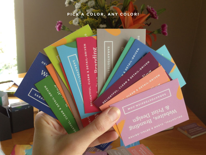
My new business cards have arrived! It was like opening a box full of joy — SO MUCH COLOR!
I had the cards printed by Moo. They’re a newer designer-y company out to “set a new standard for print.” It was my first time working with them, so I thought I’d share my experience here.
Overall, I’m very pleased with the final product, but there were some moments of peril getting there.
For one, the initial design had a thick white border at the edge of the card. When I received them I was super sad face. The cropping was sub-par to say the least. Here’s an example:
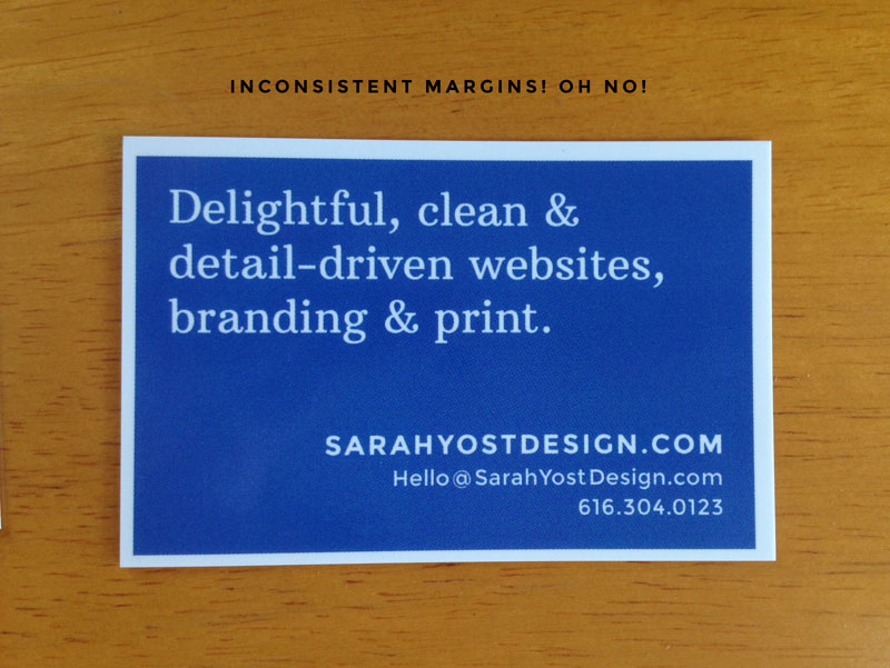
Yikes.
This is how I was hoping they’d look:
Ah, symmetry. So soothing.
I find a border can make simple, clean business cards look more finished. I was pretty disappointed by Moo’s inability to execute this design. I used the Photoshop template they provided on their website to create the files, and followed all the instructions regarding crops, bleed, trim, and safe space. I’d previously had a similar bordered design printed for dirt cheap online (PsPrint) for another project. It was about a quarter of the price and they nailed the crop, giving a nice even frame on all sides.
Frankly there was no way I was going to use that first round of cards. A few of them looked better than the one showed above, but not many. One can’t claim to be detail-oriented on the same small rectangle as those off-kilter white strips! I had ideas for trimming them myself, painting over them, or simply having a whole lot of colorful bookmarks on hand. (You guys, business cards make the best bookmarks. I don’t know what it is, but it just feels right when you tuck one between the pages.)
Luckily, when I contacted Moo and expressed my disappointment with the cards, they offered to reprint them. Their custom service was excellent and timely.
For the second printing, I modified the design, which included removing the border. It didn’t seem worth the risk. I also switched over to the matte finish. The gloss was really, really glossy. On the right design it could look awesome, but on mine it glared and showed fingerprints.
Here’s a comparison between the two finishes:
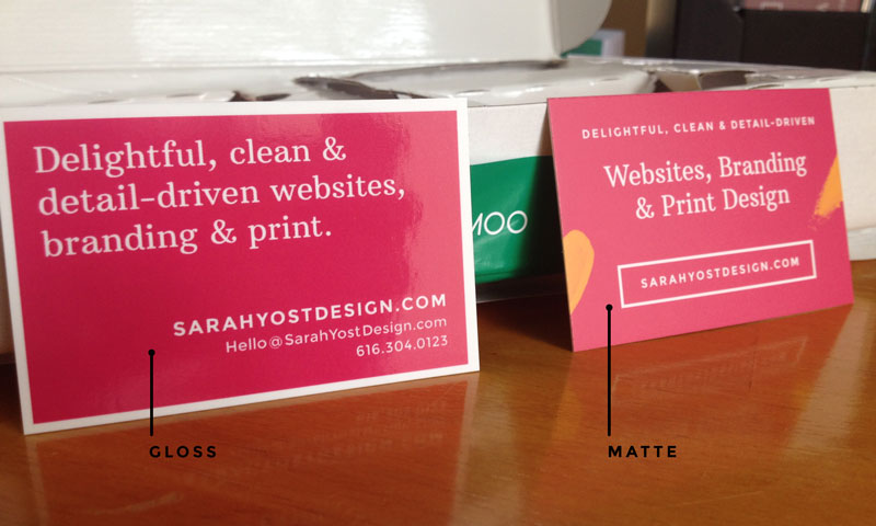
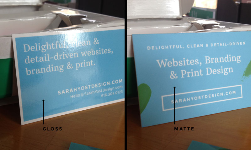
There was no flash used in the photos above. That’s just how light-reflective the gloss finish is — even in my somewhat darker office space.
So the gloss wasn’t my cup of tea, but the matte. Oh, the matte! It’s perfect. The color quality is excellent, unlike on some matte finishes (which is why I originally picked the gloss — because I wanted these cards to be all about the color). But the saturation here is beautiful. And the texture is super smooth. I got the standard quality paper weight, but it feels solid and much like a luxe version you’d buy elsewhere.
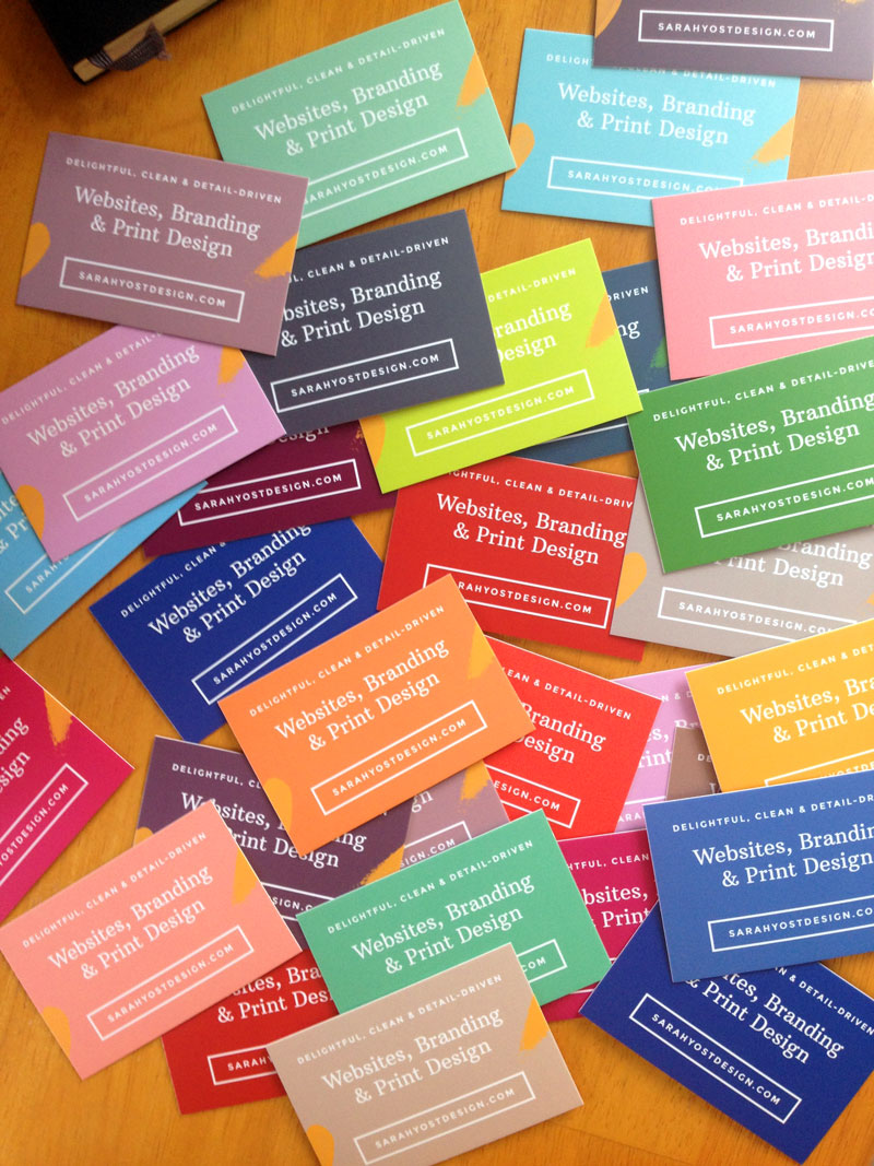
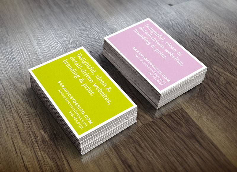
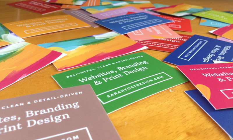
Now, the matte is awesome, but the real best thing about Moo: Printfinity. This allows you to print up to 50 different designs for your business cards. (For the reverse you’re just allowed the one universal design.) Printfinity made all sorts of ideas start rolling around in my head. But my first instinct was color. MUST HAVE ALL THE COLORS.
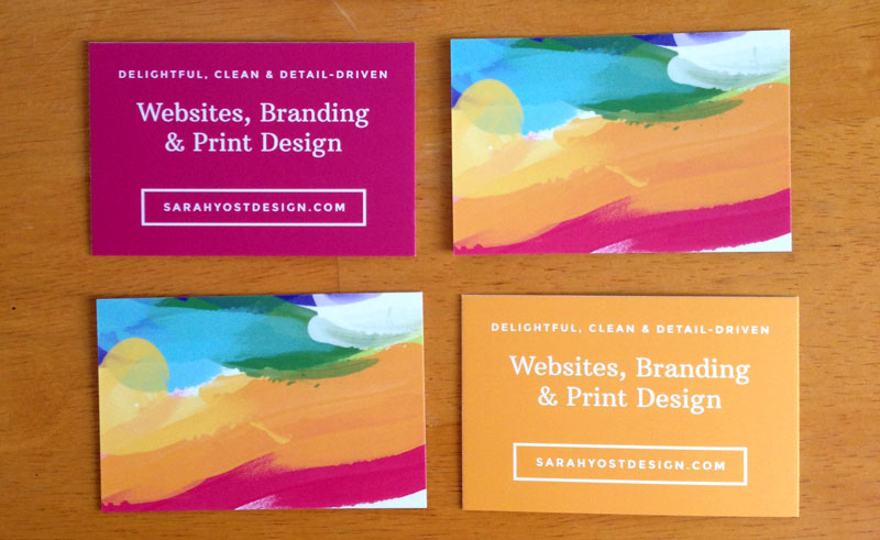
For the reverse side of the cards I made a colorful painted image that worked well with the solids. On some cards I carried this over to the front with a splash of paint. Others I kept clean.
^ Thinking about giving all of these bright white edges a swipe with a metallic gold Sharpie…
The other thing I’m not super pleased with about the cards is the crispness of the type. It’s hard to capture in photos because I’m relying on my iPhone, but once you really look at it, the discriminating eye will wince a bit. Rough around the edges! Whyyyy! I added the text in InDesign and outlined the fonts as Moo instructed, then exported as PDF/X-1a files. There’s simply no reason for this funkiness. Granted, I’m the only one who’ll notice it, but it troubles me. I’ve had much, much sharper type from other printers and even at home on my Canon iX6500. Between this and the faulty initial cropping, I’m afraid I’d be nervous sending a big client job to Moo.
Next, a word or two about Moo’s packaging. I purchased 200 cards and they arrived bundled in packs of 50s like so:
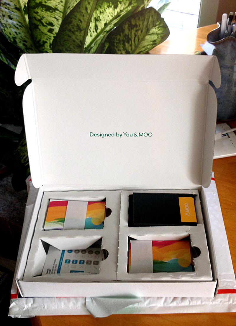
^ I’d already removed the pack from the bottom-left spot.
This packaging is a good example of form over function. It’s pleasing to see the cards all divided and bundled up and tucked into their own little nests. But once you remove the paper strip holding the cards together, they’re slip-sliding all over the place, getting bent, and forcing you to dig them out from under the cardboard dividers.
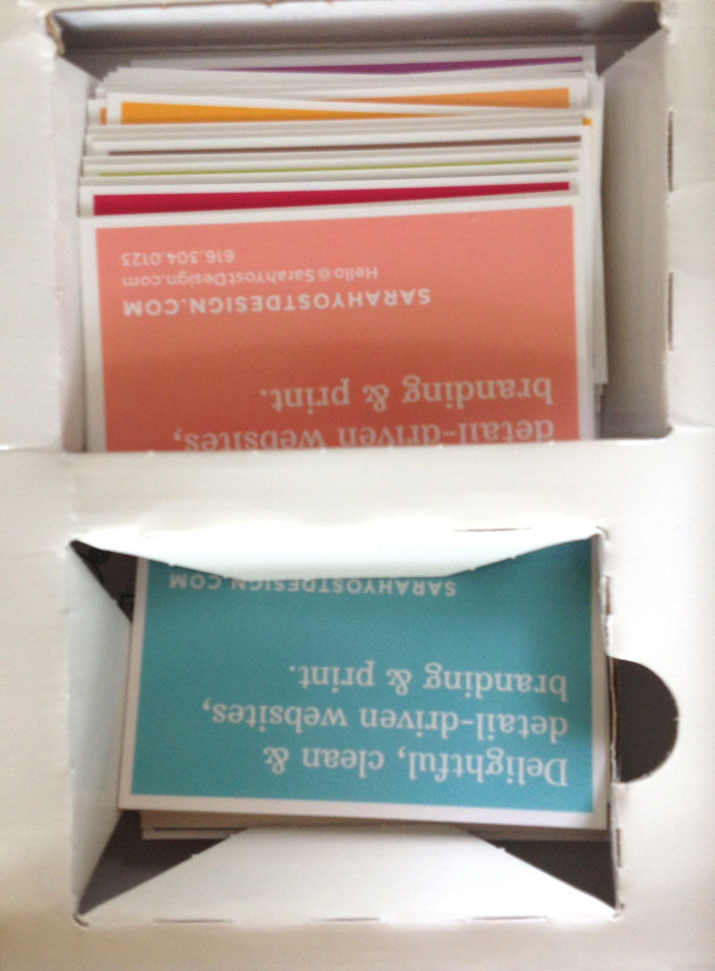
^ It’s worse than it looks.
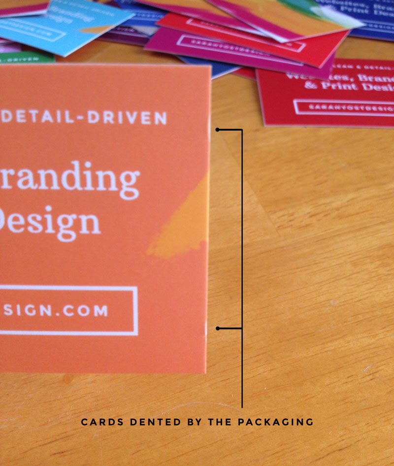
I get that maybe you’re not supposed to open the packs until it’s time to use those particular cards, at which point they should be dropped directly into your card carrier — but cmon! Who can resist ripping open a bunch of bright new colorful rectangles and throwing them in the air like confetti?! Not I! Those little paper strips lasted about 5 seconds on arrival, and then I had a hundred cards spread out all over my kitchen table like a bouquet from the print gods. It wasn’t until I stacked them back up nicely and returned them to the box that I realized this wasn’t going to be a great way to keep the cards in good condition.
Some of the cards were also dented on arrival from the nesting. Not a tragedy, by any means, but just to illustrate that the packaging is something Moo could improve on.
There was a real winner, though, in that messy cardboard contraption: the card carrier Moo provides with your purchase:
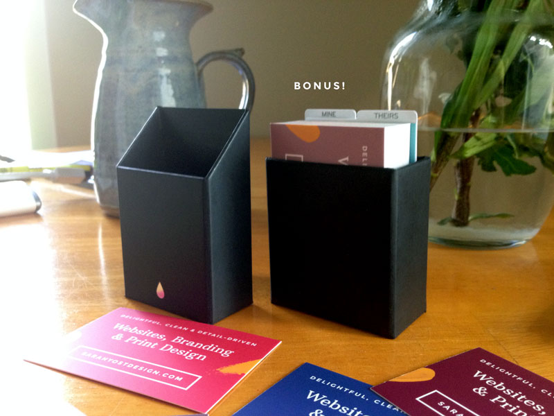
I’m doing it wrong down in the photo above. The cards should be in the other side. Ignore my foolishness, but believe: This is a great little box. Solidly constructed. Thick walls. Even after rolling around in my bag for days, the lid has stayed on and the cards within are in good condition. I’m a big fan.
Lastly, the price. I paid $70, not including shipping, for 200 cards. (Shipping was free with a discount code for first-time buyers.) That comes down to 35 cents a card. Not terribly expensive, but if you’re on a tight budget it’s worth noting that it’s possible to get 2000 cards for that same price. Just saying.
So…to sum it all up:
Moo Pros
- Gorgeous matte finish
- Excellent customer service
- Custom “Moo-size” cards — taller and more narrow than most cards, though they’ve recently begun offering standard sizes as well.
- Free carrying case
- Printfinity — up to 50 different designs on one side
- Moo is a pretty cute name (If you’re susceptible to such things. This one here, super susceptible.) (Also, their newsletter is called Moosletter. Boom.)
Moo Cons
- Packaging
- Questionable quality in execution — uneven cropping
- Not the crispest type
- More costly than other online digital printers
- Their logo is a tear, but I don’t think they’ve committed the sort of crimes that hints at. (Inappropriate.) (Not killing is definitely a pro.) (Okay, it’s an ink drop.)
Would I use them again? I’m honestly not certain. The lack of sharpness in the type and my lost confidence in their ability to execute a precise crop have me wary, especially considering the cost, but their beautiful matte finish may have forever ruined me for any other printer. Really, guys. It’s a great, great finish.
What do you think? Have you used Moo? What was your experience like?